Reading time: 7 Minutes
Whether you are a Marketing Manager, Marketing Executive, aspiring designer or small business owner the chances are you are have to negotiate working with a design agency at some point. It is true that designers have their own language. These are a mix of creative terms and technical print terms that help translate visual ideas into a verbal conversation. The design language is broad, and can be complicated to explain, especially to other non-designers.
Margins, kerning, bleed, raster and PNG are just some of the terms you are likely to hear dropped into a conversation at some stage when discussing a brief, creative ideas or production details of a design project. So don’t head into a creative meeting feeling a bit left out. We’ve put together a list of some of the most commonly used terms for you to learn. You won’t then have to get by with a lot of head nodding, whilst drifting off into a haze thinking about your chilli-con-carne dinner tonight!
The below list is supported by some example images. It is by no means exhaustive but if you throw a few of these into a conversation with your designer you may just earn yourself some kudos. For anything else that comes up in conversation don’t ever be afraid to stop the conversation and ask. As designers we’re generally a very amiable and friendly bunch, it’s just that we can get a bit giddy when we’re excited to show you the new fantastic designs we’ve produced for you, and can revert back to designer jargon.
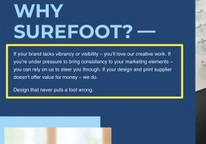
For everything else, ask Surefoot!
COMPOSITION AND LAYOUT
Composition is the arrangement of design elements that form a whole image. It should attract the viewer and guides their eye across the design. In graphic design this is often referred to as ‘layout’. Composition is made up of a number of different visual design elements, including balance, proximity, alignment, repetition, contrast and white space.
Hierarchy
In design, hierarchy is the organization of elements by level of importance. Newspapers, magazine spreads and movie posters are good examples of the use of design hierarchy. Headlines (also called display type) are usually placed at the top, while subheads and body copy fall underneath.
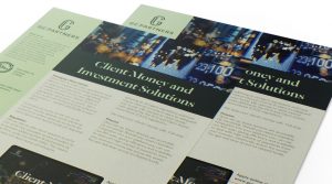
Hierarchy on data sheets with headers, sub headers and body copy
Rule Of Thirds
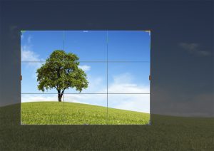
Rule of Thirds is a theory that if you divide your image with two vertical and two horizontal lines, the areas where your lines intersect will become focal points of your design. Designers use this as a guide to determine where to place important elements in their design.
How the rule of thirds can impact any design format
Thumbnail Sketch
Thumbnail sketches are rough drawings of potential design concepts or solutions. These sketches are used to visualize and grow various ideas and concepts by hand before moving to the screen.
Style Guide
A style guide is a set of standards for the design of anything related to your brand, whether it’s a printed document, business card or website landing page. The reason to have a style guide is to ensure complete uniformity in style and formatting wherever the brand is used to ensure no dilution of that brand.
Grid
A framework made up of evenly divided, intersecting columns and rows. Grids help designers to align and arrange elements in a quicker, neater, and more consistent way.
Scale
The change of size of an object while keeping its shape and proportions intact. Large scale can create drama, and smaller scale can create fine detail.
White Space
White space—sometimes called negative space—is the part of the design that is unmarked by imagery or text. It’s the space between graphic elements, images, copy, and anything else on the page. Even though it’s known as white space, it can be any colour.
White space can be as important as all other elements on the page when used wisely
Margins
The space around the edge of a page. By increasing or decreasing the size of your page’s margins you can create a more calming or a more tense design respectively.
Bleed
Bleed is when a design actually extends past its printed edge, removing the chance of white borders when it’s trimmed down after printing.
Trim
Trim size is the final size of a printed piece after it has been trimmed from its page. Trimming is indicated by crop marks that show where to cut.
Crops (indicated on the top corners) and bleed (indicated at the top) are an essential element of any print setup file
Crop
A designer can cut out or crop unnecessary parts of an image to improve framing, highlight a specific subject or alter the image’s aspect ratio.
The crop of an image within your design can add weight to balance the design comfortably
TYPE
Body Copy
The main part of text in your design or publication – the written website content, the book contents, even this type you’re reading right now, it’s all body copy.
In body copy, uppercase characters are used at the beginning of sentences or the first letter of proper names. They are also called capitals or caps. The name uppercase comes from the old-school typesetting printing presses. Printers kept capitals in the upper drawer of a desk.
Lowercase glyphs are the non-capital letters that make up the rest of a text block. The name lowercase comes from the old way of setting type with printing presses. Printers kept the lowercase letters in the lower drawer of a desk.
Lorem Ipsum
Lorem Ipsum is simply dummy text used by the design industry. It’s used as placeholder text and has a more-or-less average distribution of letters, making it look like readable English, as opposed to using ‘Add content here, add content here’ within designs when the copy isn’t quite ready.
Kerning
Kerning is the adjustment of space between pairs of letters in the same word. Certain pairs of letters create awkward spaces, and kerning adds or subtracts space between them to create more visually appealing and readable text. legibility.
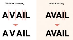
Kerning of lettering can have a huge impact on typography, especially in headers and titles
Leading
Leading determines how text is spaced vertically in lines. Leading is used when content that has multiple lines of readable text and ensures the distance from the bottom of the words above to the top of the words below has appropriate spacing to make them legible.
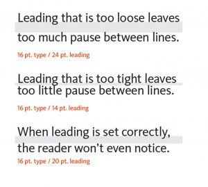
Leading will alter the way text is read and has a distinct impact on the overall design feel
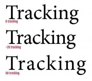
Tracking
Tracking concerns the space between letters. When we track bodies of text, we are adjusting space between every letter in a word in order to change the density or appearance of a large block of type (i.e. body copy). Tracking shouldn’t be confused with kerning, which concerns the adjustment of space between individual pairs of letters.
Tracking lettering can allow the font to ‘breathe’. This is often used in logo designing.
X-Height
The average height of lowercase letters. X-height gets its name as this value is usually exemplified by looking at the height of the letter x in any given typeface.
The median or x-height is where most lower-case letters should reach their maximum height.
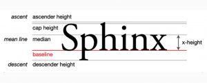
The ‘x-height’ of a font can vary greatly between fonts. This illustration also shows the ascender and descender of some letters
Ascender
The part of a lowercase letter that extends above the x-height. Some common examples of this are ‘b’, ‘d’, ‘f’, etc.
Descenders
A descender is the part of a lowercase letter that descends below the main body of the letter. Think “g” or “p.”
Orphans and Widows
This design term refers to the words or short lines that appear by themselves at the top or bottom of a column of type. It’s always a good (and easy) idea to check over your body copy before finishing up, and manually removing these when they appear.
An orphan is a single word or very short line, that appears at the end of a paragraph or the beginning of a column or a page, separated from the rest of the text.
A widow is a paragraph-ending line that falls at the beginning of the following page or column, thus separated from the rest of the text. Or the beginning of a new paragraph that starts at the bottom of a column or page.
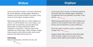
Widows and orphans indicated in paragraphs of text
Serif Typeface
A typeface with small decorative strokes (called ‘serifs’) found at the end of horizontal and vertical lines. Serif typefaces tend to look professional, authoritative, and traditional in appearance.
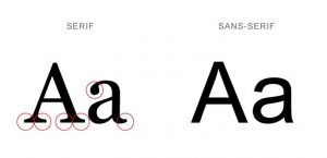
Examples of a serif and sans serif typeface
Sans Serif Typeface
A typeface without the small decorative serif strokes. Sans serifs tend to look more modern, stylish, and cleaner than their serif counterparts. Sans means “without” in French.
Script Typeface
A typeface that mimics cursive handwriting. Script typefaces tend to look elegant, and have a flowing, cursive stroke.
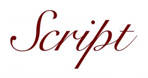
An example of a script font style
Legibility
The measure of how easy it is to distinguish one letter from the next. Legibility has a lot to do with your choice of typeface and how you use it, i.e. simpler serif or sans serif typefaces are generally better for smaller body copy.
Alignment
The lining up of elements to achieve balance, order, and a more logical layout. There are also four common types of typographical alignment – center, left, right, and justified, each with their own time and place for application.
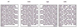
The alignment of text can have a huge impact on the readability of text, especially in long paragraphs
Pull Quote
A short quote or excerpt pulled from the main text and used as a visual element to help highlight important ideas and draw interest to the piece. Pull quotes are very common in magazine design.
COLOUR
Palette
A palette is the range of colours used in a design. These are colours that work well together and are often aesthetically pleasing. Designers will define a palette for a project to create consistency and evoke a specific feeling.
An example of a colour palette
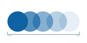
Monochrome
A colour scheme built out of only one colour, including lighter and darker tones of that colour.
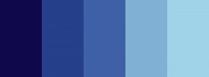
An example of a blue monochrome colour choice
Analogous
A colour scheme built out of three colours that are next to each other on the colour wheel.
Complementary
Complementary colours are opposites on the colour wheel. This relationship will produce visual tension and “shock.”
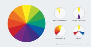
Colour scheme options showing monochromatic, complementary, analogous and triadic colour sets
CMYK
CMYK is a 4-colour printing process made up of cyan, magenta, yellow and key (black). CMYK colours in print will never appear as vibrant as RGB colours on screen because CMYK creates colour by adding colour together (making images darker) while RGB colours come from light.
RGB
RGB or ‘Red, Green, Blue’ is a colour model that is used for on-screen purposes and will tend to be more vibrant than CMYK versions of the same colour.
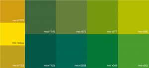
Pantone (PMS)
The ‘Pantone Matching System’ is a standardized system of colours for printing. Every Pantone shade is numbered, making it much easier for people to reference and identify exact shades of colour. These are often seen in corporate guidelines and used as references in company stationery.
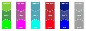
An example of how colours can change in the CMYJK, RGB or Pantone colour formats
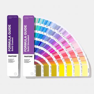
Pantone colour book
Hex
A hex is a six-digit number used in digital design HTML, CSS, and design software applications to represent colours. These are for online use only.
Colour Theory
The study of how colours make people feel and their effects on a design is known as colour theory. Colour theory is used to explore the best types of colours to work in different design instances—for example, choosing a pastel scheme for a website that needs to feel soft, or picking red and yellow for a magazine ad that needs to evoke energy.
Warm Colours
Colours that make you think of heat and warmth, like reds, yellows, oranges, etc.
They give a friendly, happy, cozy vibe.
Cool Colours
Colours that make you think of colder temperatures, like blues, greens, violets, etc. These colours tend to have the ability to calm and soothe.
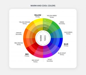
A colour chart showing the cool & warm colour areas
Gradient
Gradient is a gradual change from one colour to another. (For example, blue transitioning gradually to green). There are two common types of gradients: radial and linear.
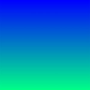
A blue to green colour gradient
Opacity
The degree of transparency an element has. The lower the opacity, the more transparent an element is. For example, 100% opacity means an object is solid.
An example of opacity applied to the colour blue
Hue
Hue is a way to describe a pure colour without tint or shade (added white or black). For instance, any colour on the colour wheel is a hue (blue, yellow).
Tone
Tone refers to a hue with grey added. The tone will lower the intensity of colour, and it can become dull.
Tint
Tint refers to a hue with added white to lighten it and make it paler. The tint can range anywhere from a slightly lighter colour all the way to completely white, with barely any colour.
Shade
This refers to black added to a colour. This is the opposite of Tint—instead of making the colour lighter, shade will darken it.
IMAGERY
Resolution
The resolution of an image determines the quality. As a rule of thumb, the higher the resolution, the higher the quality. A high-resolution image will be clear and crisp whereas a low-resolution image will feel a little pixelated and blurry.
DPI
DPI stands for “dots per inch,” which is a measure of a printer’s quality. For high-quality printing, 300dpi is recommended.
PPI
PPI stands for “pixels per inch,” which is a measure of pixel density used by electronic image devices. You’ll likely see this used with scanners, cameras, TVs or monitors.
Pixels
Pixels are square-shaped dots that make a digital raster image. The more pixels an image has, the higher its resolution.
Vector graphics
Vector graphics are small graphics that use math to display images. They can be enlarged without losing quality and are essential for cross-platform designs (i.e. billboards, large format exhibition graphics, etc.). Unlike rasters, vectors won’t get blurry when scaled.
AI
AI stands for Adobe Illustrator document. This is a file format developed by Adobe Systems to represent single-page vector designs.
EPS
EPS stands for Encapsulated Post Script. This is a resizable file format that is commonly used for vector designs.
A PDF is a Portable Document Format developed by Adobe that can be universally downloaded and viewed by any computer. PDFs are most suitable for sharing previews of work and are universally viewable.
Raster graphics
Raster graphics are composed of pixels on a grid, where each pixel is assigned a colour value. They are good for assigning special effects, colour correction and manipulating photos.
GIF
GIF or Graphics Interchange Format is a raster file format that supports animation and transparency. GIFs can only display up to 256 colours, allowing for very small file sizes.
JPEG
Joint Photographic Experts Group is also known as JPEG, the most widely used raster file type for web-based designs. JPEGs are compressed files that load quickly. You’ll typically see them used for emails, banner ads, online photos, and pretty much anything else online. Unlike GIFs, they cannot have a transparent background (a white background will be added automatically).
PNG
PNG stands for Portable Network Graphics, a web-based format that does not lose quality when compressed. PNG files were created to improve on the quality of GIF files.
PSD
PSD or Photoshop Document is the uncompressed working raster image file created by designers in Adobe Photoshop. It allows for layers to remain within the image file for further colour or layout editing.
TIFF
TIFF stands for Tagged Image File Format, a common format for exchanging raster images between applications. TIFF produces a higher quality image than a JPEG or PNG, and is widely used among publishing industries and photographers.
Contrast
Contrast occurs when two elements on a page are different. For example, it could be different colours between the text and the background colour or dark vs. light colours.
Saturation
The degree of intensity and vividness of a colour. For example, a low-saturation colour may appear pale and faded, whereas a more heavily saturated colour may appear more vibrant and colourful.
Stock Photo
Widely available, stock photos are a professionally shot photograph available online for licensing. Using stock images saves on the cost of a having a professional photo shoot but can be restrictive if the subject is particularly detailed.
BRANDING
Brand
A collection of concepts, ideas, and emotions that encapsulate your company’s values and ethos. A brand is a mix of all the fine conceptual details that make up the company, from the content the brand promotes, the way employees talk, the words used, the values upheld, etc.
Lettermark
A lettermark is a type-based logo made of a few letters. It’s often used if a company’s name is made of two or more words. A lettermark will shorten the company name by using only its initials, resulting in simplicity. For instance, NASA is easy to say and remember compared to National Aeronautics and Space Administration.
Examples of Lettermark logos
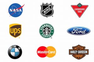
Pictorial Mark
Also known as a brand mark, a pictorial mark refers to a graphic-based logo. It’s usually an icon that has been simplified and stylized to represent a brand. For instance, Twitter’s icon is a bird, and it’s recognized around the world as Twitter.
Examples of Pictorial mark logos
Abstract Mark
The opposite of a pictorial mark, an abstract mark is not based on a real object. Instead, it’s an abstract geometric representation that represents a business. Adidas’s logo doesn’t represent anything from the real world. Instead, the brand distilled their ideas into a geometric shape that best represents them.
Examples of Abstract mark logos
Emblem
An emblem logo is a mark in which the name of a business is contained within a single shape. An emblem is not necessarily just for the corporate world—you’ll see emblems representing schools or sports teams.
Examples of emblem mark logos
Logotype
A type of logo where the name of the company designed in a visual way. Think of brands like Google, Ikea, Disney.
A logotype is the name of a company that is designed in a visually unique way for use by that company. Most of the time when people refer to a logo, they’re referring to the brand’s logotype.
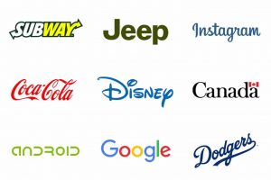
Examples of Logotype or Wordmark logos
Brandmark
A type of logo design where a symbol is used in place of the company name, i.e. the Apple logo. Brandmarks are commonly accompanied by a logotype, but not always.
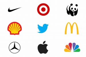
Examples of Brandmarks logos
Website Elements
Header
Design elements repeated at the top of every page is called a header.

A website header bar
Navigation & navigation bar
Navigation is a roadmap to the most important parts of a website and should be visually consistent across all pages. A navigation bar is a set of links repeated on each page that often includes links to pages like “About us”, “Products,” “Contact us” and “Testimonials.”
A website navigation bar
Breadcrumb trail
Breadcrumbs are navigation elements that generally appear near the top of a page to show users the section hierarchy of the current page.
A website breadcrumb trail example
Body text
Body text is the main written content of a page.
Website body copy example
Links
Any word or an image can be a link that can take users to another page.
An example of a website link
Sidebar
A sidebar is the left or righthand column of a page typically used for either vertical navigation links or advertising. It may also contain site search, subscription links or social network buttons.
An example of a website sidebar
Banner
Typically located at the top of a page or in a sidebar, banners are advertisements that link to other websites.
An example of a website advertising banner
Footer
Design elements repeated at the bottom of every page is called a footer.
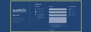
An example of a website footer area
HTML
HTML stands for HyperText Markup Language. This is the standard coding language for websites that creates all of the fonts, colours, graphics and links you see online.
Landing page
A landing page is a single page that appears in response to search engine result. Landing pages are used for lead generation.
User interface (UI)
User interface is the design of applications for computers, mobile devices and other devices to maximize their usability and the user experience.
Wireframe
Basic images that display the essential functions of a website are known as wireframes. Designers use wireframes to show how a page or site works.
Well, there you have it, a small dose of some of the more common terms that you might encounter when working with (or as) a graphic designer.
Whether you’re a designer or not, do keep in mind that while the terminology is important, it’s not the be all and end all. Definitions change and adapt to different circumstances, so keep your eyes peeled for new concepts and ideas, keep an open mind, and ask questions! There’s never any shame in asking others to help clarify any particular concept that you’re unsure of. Or, if all else fails, Google away to your heart’s content.