First impressions count
Earlier this month it was World Book Day and here at Surefoot we’ve been looking at how book covers have evolved, shaped by design trends, and how the look of the cover influences customer choice in the same way that a company brand impacts whether a customer chooses to consider working with them.
Over the years book covers have gone from being hardbacked and plain with the main function being to protect the pages inside to becoming a platform to market and advertise the contents, enticing customers to purchase. The cover gives a glimpse into the book, communicating what’s inside in the same way that a logo, a website, a product’s packaging or a piece of customer collateral gives an impression of a brand and what the company is all about.
The English idiom “don’t judge a book by its cover’, used to describe not judging something or someone by outward appearance as it or they may be different, does not ring true when it comes to your company brand. First impressions really count when it comes to reaching customers and differentiating yourself from your competition.
The same is true of the designs of book covers, those which are more alive and more impactful, draw you into the story, creating curiosity and building suspense, leaving the customer wanting to know more. As book covers have evolved designers have incorporated trends from the graphic design industry to influence the look of the covers.
Have you ever stood in a book shop perusing the covers, with an open mind to your choice? You may dismiss the ‘romantic novels’ or ‘crime novels’ as they are not your genre of choice but your are also subconsciously dismissing all the other books that just don’t appeal to your visual senses.
If we look at some of the 2021 design trends, we can see how some of them have been used by book designers to entice customers. You will also see some examples of those same trends in the accompanying logos. Notice how the company brands now start to create an emotional response that you may not have noticed previously. This emotional reaction is already creating assumptions in your mind that may or may not be correct. Like it or not this is sometimes a make or break moment for brand confidence and belief.
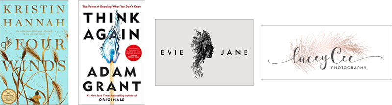
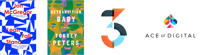
Trend 1:
The use of text intertlinked with images or the replacement of letters with images, objects or photos add intrigue for the reader and hint at something deeper to explore:
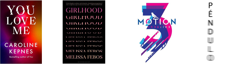
Trend 2:
Double exposure or affected text are used to create the illusion of intrigue or mystery:
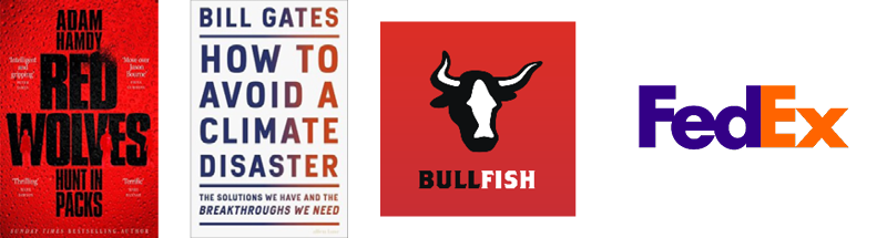
Trend 3:
Bold, impactful typography grabs attention and shouts ‘Look at me!’. These are fighting to be front and centre of your vision:
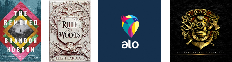
Trend 4:
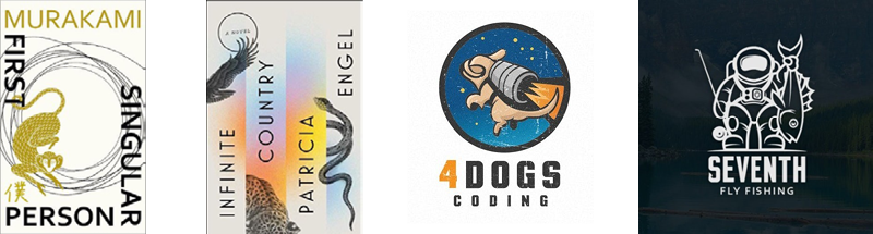
The creation of the illusion of depth, draws readers into the book or holds your attention to understand the multiple ‘layers’ of the logo:
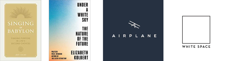
Trend 5:
Minimalism allows the book to stand out in a calming way from all the other busy covers. The simplicity of the logos purveys the company to be clever and efficient:
Trend 6:
The use of collages and patterns helps the book stand out as unique. This hints at more going on than first perceived:
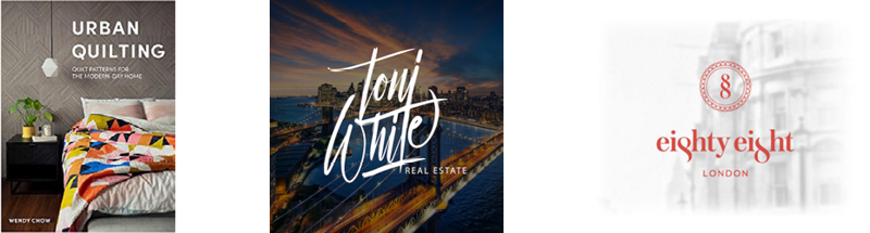
Trend 7:
Genuine photos create an authentic real feel to the book and give the brands a very grounded, personal feel. The brands will tend to hint at a service based offering:
Trend 8:
Busy Designs with lots of images and text creates a unique and quirky look. They tell you that these books, or companies are likely to be more artisan in nature:
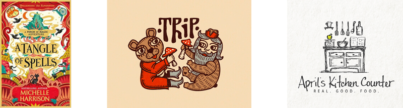
Trend 9:
Illustrations, used to capture the tone of the book and make it stand out on the shelf are a great way to stand a cover and company apart. The illustration can be used to show ‘character’ and fight against any corporate mindset:
First impressions for any book or any business really do count and making a good first impression can not only impact whether a customer chooses to become a customer but also whether they continue to remain a customer.
You will notice that many of the branding examples suddenly give a very distinct feel when you cross reference them to a book genre. For all the good examples here of strong design and visual tricks to draw you in you must also consider the ‘also rans’. Those books that you didn’t even notice when viewing left to right to left again on the shelf. The most important analogy here is ‘Are you the book that gets dismissed or ignored?’ You may have the best story to tell but unless you get noticed first you may never get the chance to tell it.
At Surefoot we believe design tells the story of your company to your customers and to the world at large. In an over-saturated marketplace, it’s more important than ever to stand out from the competition with a unique, captivating, and instantly recognisable brand that says something about you, your company and your philosophy.
Think of design as the visual means of communication between you and your customers. A means of communicating the spirit of your company and what makes it different.