Classic Brand Evolution
In recent unsettled times we have seen a mixed reaction from some of the world’s biggest brands to the Coronavirus Pandemic. Some have thrived, most have struggled but managed to weather the storm, and others have gone into virtual media lockdown.
So what do we expect of some of the world’s most recognisable brands? Does our loyalty hinge on the recent treatment of their customers and employees, or will we be quickly seduced by smart marketing and welcome back offers?
I think most people are certainly hoping for a new normal, where we have rediscovered an appreciation for local business and a community spirit. We may now appreciate our local pubs a little more than before, proving the point that you don’t know what you’ve got until it’s gone. We may even discover that we don’t need retail therapy quite as much as we thought, and that recycle and upcycle become more commonplace in UK homes. Did brands such as Sports Direct and Wetherspoons cause irreparable damage to their brands, based on the media attention highlighting their management of staff during lockdown? Have Netflix and TikTok become the new norm, driven by our thirst for digital content? And has the reliance on online shopping called time on some of the largest High Street brands?
Brand relaunches
Whatever situation we find ourselves in we are already starting to see a targeted push by some of the big brands to entice us back to their stores and fast food restaurants, whet our tastebuds for new consumer goods and convince us of their community spirit that was not necessarily top of their agendas pre-covid. Call me a sceptic but the big brand’s support for Pride and the LGBT community, as well as Black Lives Matter is no coincidence in a time where a worldwide audience was paying more attention to TV and online media than ever before.
Many of the world’s best known brands also rely on their brand heritage to target their advertising, enabling them to talk to customers like an old friend greeting them back with a warm hug rather than a sharp suited salesman convincing you of the benefits of his wares. It was this brand loyalty that created discussion in the Surefoot office recently when considering the first things we wanted to do post lockdown. Was it a first Big Mac in months, a trolley dash down the aisles of Primark or was it a pint in the Fox and Feathers that was top of our wish list?
Brand histories
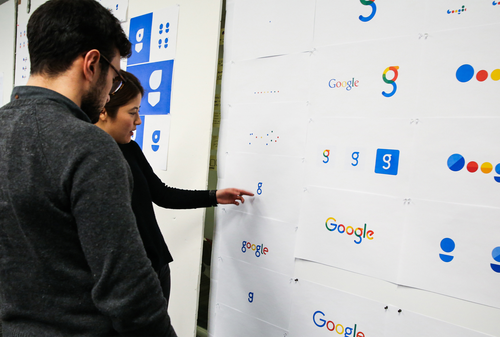
Some of the most recognisable brands like Coca Cola have been with us for well over a century, whilst relative newcomers like Google just feel like they’ve always been there. The office discussion about brand winners and losers during the pandemic led us to research some of their histories, specifically their logo brand or typemark and how those have changed throughout the years. Have they kept up to date with trends and can you remember their branding when you first discovered them as a child?
We’ve put together a quick visual reference of some of those brand journey’s, a few details of their history and some interesting facts about those companies. A trip down memory lane and a few titbits of information you may not have known before.
Evolution helps brands stay fresh and relevant. By comparing their early and current brand iterations we start to understand their brand values and how their target market may have shifted over the years. It gives us a historical snapshot of what was fashionable at that point in time and reveals trends and developments in branding along the way.
Apple Branding
Turnover: $260.17 Billion (2019)

A Short History:
Founded in April 1976 by college dropouts Steve Jobs and Steve Wozniak. They wanted to make computers small enough for people to have them in their homes and offices. Simply put, they wanted a computer that was user friendly. Apple’s first logo was created by Apple Computer Co co-founder, Ronald Wayne, during the company’s incorporation in the 1970’s. It was a far cry from the brand we recognise now. It used a line drawing image to represent Isaac Newton, who revolutionised science with his discoveries on gravity. Who doesn’t remember the story about the apple falling on his head?
Apple logo
Apple’s first logo was a depiction of this event, supported by a quote from famous poet William Wordsworth that reads ‘Newton…a mind forever voyaging through strange seas of thought’.
The Newton logo was short-lived as Steve Jobs reportedly believed it to be too old-fashioned. Designer Rob Janoff was hired to create the now classic logo of the bitten apple. This was then established before the end of the company’s first year in business.
The original Apple shaped logo contained a rainbow spectrum, aligned with Apple’s computer ‘Apple II’, which was the world’s first computer with a colour display. The colours of the logo do not though follow as we might expect for a standard rainbow. Steve Jobs was keen for the green to feature at the top because ‘that’s where the leaf was’. It is also speculated that the original logo, with its bite taken from one side symbolises the death of Alan Turning, the father of modern computing, who took a bite out of an apple poisoned with cyanide that ultimately took his life.
Jean-Louis Gassée, former Apple Executive once said ‘One of the deep mysteries to me is our logo, the symbol of lust and knowledge, bitten into, all crossed with the colours of the rainbow in the wrong order. You couldn’t dream a more appropriate logo: lust, knowledge, hope and anarchy’.
The current logo, the one that everyone recognises, was used as more of a product branding tool upon Steve Jobs return to Apple in 1997. Jobs realised that the Apple logo could be leveraged to their advantage. If the shape of the Apple was universally recognisable then why not put it where people could see it. When Apple released their first ever iMac the logo lost its rainbow colouring as it would have looked out of place on the sky-blue computer.
Iterations since then have had the logo in a metallic look with embossing, through to the ‘Glass’ themed logo. Today the company uses a more modernised flat ‘Millennial’ Apple logo. This is used in three colour options of white, black and silver.
APPLE FACTS:
1. In 2018, Apple sold 572,000 iPhones a day.
2. Apple earns $300,000 per minute and is worth more than the entire Russian stock market!
3. Apples co-founder, Ronald Wayne, sold his shares back to Jobs and Wozniak after just 12 days for $800. Today they would be worth $95 billion.
4. Jeff Goldblum was offered the voice of Siri by Steve Jobs himself
5. Every iPhone advert displayed the time 9:41, this was the time Steve Jobs revealed the original iPhone back in 2007.
KFC
Branding
Turnover: $2.6 Billion (2019)
A Short History:
KFC was founded by Colonel Harland Sanders, a 65 year old entrepreneur who began selling fried chicken from his roadside restaurant in Corbin, Kentucky, during the Great Depression of the 1930’s. Sanders identified the potential of the restaurant franchising concept, and the first “Kentucky Fried Chicken” franchise opened in Utah in 1952.
The Sanders Court & Café was popular with travellers on their way to Florida through the town of Corbin, Kentucky but when Interstate 75 was built in the 1950s—bypassing the town—Sanders was forced to retire and sell the restaurant. In 1952, living on his $105 a month Social Security benefits check Colonel Sanders embarked on his last career.
Sanders began traveling across the country, cooking along the way, determined to franchise his fried chicken. Pete Harman was a friend of Sanders and operated one of the largest restaurants in Salt Lake City. Persuading Harman to begin selling his recipe chicken in his “Do Drop Inn” restaurant was a success, increasing sales by 75%. It was Don Anderson, a painter hired by Harman, who came up with the name “Kentucky Fried Chicken” and it was Harman that created the original bucket that still exists today. Soon several more restaurant owners signed franchise agreements with Sanders for the princely franchise fee of four cents per chicken.
It was during this early franchise period that the Colonel met Dave Thomas. Dave at the time was working as a cook for the Clauss family operators of the Hobby House restaurants. It was Dave who developed the classic wobbly red-and-white-striped chicken bucket that became the classic sign outside of each Kentucky Fried Chicken restaurant.
By 1964 there were over 600 franchised Kentucky Fried Chicken locations in the U.S., Canada, Mexico, England, and Jamaica. At the age of 73, Harland sold most of Kentucky Fried Chicken to John Y. Brown and Jack Massey for two million dollars.
KFC logo
The original KFC logo was designed in 1952 and featured a wordmark, Kentucky Fried Chicken, as a hand-drawn typeface with enlarged first letters “K”, “F” and “C”. The KFC emblem, which is a Colonel Sanders portrait, was placed on the right of the wordmark.
Since 1952, the Kentucky Fried Chicken (KFC) logo has changed about four times, but the distinctive picture of Colonel Sanders has always stayed the same.
It wasn’t until 1991 that colour was added into the KFC logo to show a lively image of the Colonel. It was during this time that the name Kentucky Fried Chicken was abbreviated into “KFC” to get away from the word “fried” that meant fatty and made their restaurant seem unhealthy to their customers.
The 1997 logo was designed by Landor Associates. The Colonel Sanders head icon from the last two logos is replaced with a new, more detailed, Colonel Sanders symbol showing his tuxedo.
In 2006, the Colonel Sanders symbol was given a facelift, removing the wrinkles and replacing his tuxedo with an apron. The logo now had thicker lines on it, which help it stand out more. A San Francisco based branding company named Tesser remade the American icon KFC logo into an appealing piece of art by adding bright colours and tight lines without having to use shading.
The 2014 iteration of the logo is a throwback, used mainly in advertising, and is an homage to the 1952 and 1978 logos. In 2016, the whole new look was launched with keeping some elements from the 2006 logo. In 2017, the new design began to roll out worldwide. Also, it is the first logo since the 1991 logo where the Colonel Sanders head icon is used.
In late 2018, a new version of the logo was introduced across many countries. The illustration of Colonel Sanders’ head was modified slightly, noticeably by making his right ear clearer to see. The wordmark was altered significantly, taking on a more slab-serif appearance. Some countries still use previous designs.
KFC FACTS:
1. KFC was first known as Sanders Court & Café
2. There are around 23,000 KFC locations across the world.
3. Kentucky Fried Chicken rebranded to KFC to avoid paying licensing fees to the Commonwealth of Kentucky, contrary to many rumours at the time regarding genetically modified chickens!
4. In Japan, it is a Christmas tradition to eat KFC with many having to book weeks ahead.
5. In order to keep the KFC Original Recipe a secret, there is a company that mixes the first half of the 11 spices then ship it to McCormick, who adds the second half to the mix before sending it back to KFC
6. KFC was the first fast food chain in China and the country now has more KFC outlets than the United States.
7. When KFC first opened up in China their slogan “Finger Lickin’ good” was unfortunately translated in Chinese as “eat your fingers off.”
google
Branding
Turnover: $162 Billion (2019)

A Short History:
Google was invented by computer scientists Larry Page and Sergey Brin. The site was named after a googol—the name for the number 1 followed by 100 zeros. To the site’s founders, the name represents the immense amount of information that a search engine has to sift through.
In 1995, Page and Brin met at Stanford University while they were graduate students in computer science. By January 1996, the pair began collaborating on writing a program for a search engine dubbed Backrub, named after its ability to do backlink analysis.
Next, fuelled by the rave reviews that Backrub received, Page and Brin began working on developing Google. It was very much a shoestring project at the time. Operating out of their dorm rooms, the pair built a server network using cheap, used, and borrowed personal computers. They even maxed out their credit cards buying terabytes of disks at discount prices.
After further development, the Google search engine eventually turned into a hot commodity. Sun Microsystems co-founder Andy Bechtolsheim was so impressed that after a quick demo of Google, he told the pair, “Instead of us discussing all the details, why don’t I just write you a cheque?”
The cheque also enabled them to raise $900,000 more for their initial round of funding. Other angel investors included Amazon.com founder Jeff Bezos.
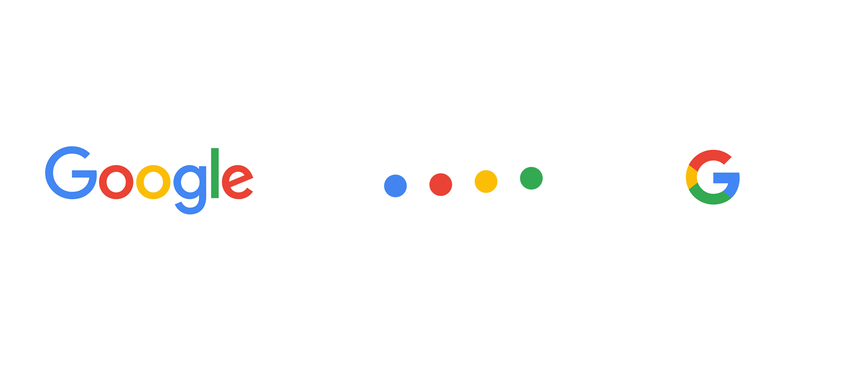
Google logo
The search engine’s very first logo actually predates the name “Google.” Larry Page and Sergey Brin originally called their web crawler “BackRub.” Brin and Page chose this name because the engine’s main function was to search through the internet’s back links.
Some sources credit Page with the creation of the first Google logo, while others say Brin designed it with a free image editor called GIMP. Whomever it was, their design wasn’t exactly the most polished.
A mutual friend introduced Brin and Page to Stanford assistant professor Ruth Kedar. Because they weren’t in love with their logo, they asked Kedar if she’d design a few prototypes.
She started with a mostly black logo using the Adobe Garamond typeface. She also removed the exclamation point that was in the original logo.
Of her designs, the eighth design was chosen for its simplicity. Ultimately, Kedar wanted to show Google’s potential to become more than just a search engine (hence the removal of the magnifying glass). She also changed the traditional order of the primary colors to reemphasize how untraditional Google was.
In 2015, designers from across Google met in New York City for a week-long design sprint aimed at producing a new logo and branding. Following the sprint, Google’s logo changed dramatically. The company preserved its distinctive blue-red-orange-blue-green-red pattern, but changed the typeface from Catull to the custom schoolbook-inspired Product Sans. At the same time, Google also rolled out several variations on its logo, including the rainbow “G” that represents the smartphone app and the favicon for Google websites, and a microphone for voice search.
Google’s logo is also now dynamic. When you begin a voice search on your phone or tablet, you’ll see the Google dots bouncing in anticipation of your query.
As you speak, those dots transform into an equalizer that responds to your voice. And once you’ve finished talking, the equalizer morphs back into dots that ripple as Google finds your results.
Google doodles
In 1998, Google started playing with the Google Doodle — a temporary modification of the traditional Google logo. The first Google Doodle originated in 1998 — before the company was technically even a company. Page and Sergey were attending the Burning Man festival. As a kind of “out of office” message, they put a stick figure drawing behind the logo’s second O.
Two years later in 2000, Larry and Sergey asked current webmaster Dennis Hwang, an intern at the time, to produce a doodle for Bastille Day. It was so well received by users that Dennis was appointed Google’s chief doodler and doodles started showing up more and more regularly on the Google homepage.
In the beginning, the doodles mostly celebrated familiar holidays; nowadays, they highlight a wide array of events and anniversaries from famous birth dates to the Ice Cream Sundae.
To decide which events, figures, or topics get doodles, a team gets together periodically to brainstorm. Doodle ideas can also come from Google users. After an idea or doodle pitch gets the green light, the actual doodles are designed by illustrators and engineers.
Google reported in 2015 that they’d launched more than 2,000 doodles for various homepages around the world. While Google hasn’t shared more recent stats on its doodles, it is anticipated that they’d produced over 4,000 by 2016.
Google has continued to embrace doodles with a verified Twitter account devoted to updating its audience about newly-published doodles. The account has over 127,000 followers.
View all the Google Doodles here: https://www.google.com/doodles#archive


GOOGLE FACTS
- Google performs over 65000 searches per second, equating to approximately 1.2 trillion searches per year.
- Google owns misspelled words of its own too, like “gooogle.com”, “gogle.com”, “googlr.com”.
- Swedish Chef from the Muppets is a search option in Google Translate, as well as Pirate and Klingon.
- Gmail was launched on April fool’s day.
- Google images launched in 2001, and immediately stored 250 million images to search through.
- Since 2010, Google has been buying on average one company per week.
COCA COLA
Branding
Turnover: $37 Billion (2019)
A Short History:
The drink Coca-Cola was originated in 1886 by an Atlanta pharmacist, John S. Pemberton (1831–88), at his Pemberton Chemical Company. His bookkeeper, Frank Robinson, chose the name for the drink and penned it in the flowing script that became the Coca-Cola trademark.
In 1865 during the American Civil War a Confederate colonel named John Pemberton took a slashing saber wound to the chest and had to be carried away from the fight. His doctors gave him a great deal of morphine to ease what they thought might be his last few hours. But, like many Civil War veterans, he became dependent on the painkiller, even going so far as to start a pharmacy in Atlanta after the war to ensure a steady supply of his drug.
After about a decade, with his daily opiate habit taking its toll, Pemberton started looking for a cure.
Pemberton had heard good things about coca wine, an admixture of wine and cocaine which was all the rage in France, and resolved to try it out.
His first product, Pemberton’s French Wine Coca Nerve Tonic, was a strong shot of alcohol mixed with cocaine and marketed as a cure for a long list of ailments. The drink was whipped up in batches of thick syrup and delivered to pharmacies, where it could be mixed with soda water and dispensed by trained professionals.
However, disaster threatened Pemberton’s new venture when, in 1886, prohibition fever swept over his part of Georgia and halted the production and sale of alcohol. Cocaine, however, was still totally fine. Pemberton reformulated his product into a non-alcoholic beverage and kept right on selling it — although, by 1888, the recipe contained only around nine milligrams of cocaine, which is about one-tenth the usual recreational dose. Interestingly, though no Coke product has contained cocaine since 1903.
Coca-Cola logo
Coca-Cola is one of the most famous logos in the world today, and its curvey flowing script was designed by Dr John Pemberton’s bookkeeper Frank Mason Robinson who realised that the two curly ‘C’s would look great in advertising,
During 1903 “trademark registered started to appear within the swooping tail of the Coca-Cola’s first “C” letter. The reason for this change was in accordance with new laws that required companies to have to re-register their trademarks. The word “DRINK would also start to appear in the mid 1920s above the logo mainly in signage and advertisements.
During 1941 Coca-Cola removed the tail “C” trade mark notification and started placing it directly underneath the logotype. Although the official order for the notification to read “REG. U.S PAT. OFF.” It’s actually appeared in several different variations.
During the beginning of the early 1950s the trademark had been simplified to state “Trade-mark ®” and became common practice to use in 1962. From the image below you can see how the trade mark changed overtime.
In June 2007 Turner Duckworth helped revitalise the Coca-Cola brand presence and created a visual celebration of the simple pleasure of drinking a coke anytime. The rebrand won numerous awards and reconnected the drink with the people who grew up with the brand, ultimately increasing sales.
When it comes to colour Coca-Cola is most famous and recognisable for its white scripted text on that distinct bright red coloured background. Through research it is said that the red colour portrays power, excitement, energy and passion. While also stimulating a person’s appetite which is a good fit for branding a soft drink!
With regards brand recognition, a report suggested that a staggering 94% of the entire world’s population recognised the red and white logo rather than the brand name itself to distinguish the brand and its product.
Due to Coca-Cola’s red and white mixture of brand colours there is a myth that they themselves invented Santa Claus as we are familiar with today wearing the red suite with white trim outline.
This is unfortunately just a rumour as there are countless pictures of Santa in his red and white suit before Coca-Cola’s first Santa advert that was in 1931. But you have to give credit to Coca-Cola for its part in popularising Santa Claus and turning him into the rosy cheeked, large and jolly man that we associate him with in modern times.
COCA COLA FACTS
1. The first servings of Coca Cola were sold for 5 cents per glass. During the first year, sales averaged a modest nine servings per day in Atlanta. Today, daily servings of Coca Cola beverages are estimated at 1.9 billion globally.
2. Interbrand, the authority on brand names and their value, lists Coca-Cola as the world’s third most valuable brand (behind Apple and Google)
3. The hand drawn font used to create the Coca Cola logo is now known as Spencerian script. It is also the chosen font of the Ford Motor Company and Budweiser, to name two imitators).
4. To this day, Coca-Cola’s brand identity is so powerful that, while blind taste tests actually do reveal most people prefer the taste of Pepsi, non-blind tests, where participants can see the labels, yield the opposite result every time.
5. In 2012, the Coca-Cola company announced a deal to export its product to Burma. With this venture, Cuba and North Korea were left as the only two countries in the world where you could not legally obtain a bottle of Coca-Cola.
6. In 1928, the U.S. Olympic team arrived in Amsterdam with 40,000 bottles of Coca-Cola, its official sponsor.
7. Every day, people all over the world drink 1.9 billion servings of Coca-Cola between them. It is, by some measures, the most widely distributed product in history.
8. The drink was even carried into space. On the July 12, 1985, the anniversary of the billionth bottle, it was carried aboard the Space Shuttle Challenger for very important research into whether water can be carbonated in microgravity (it can).
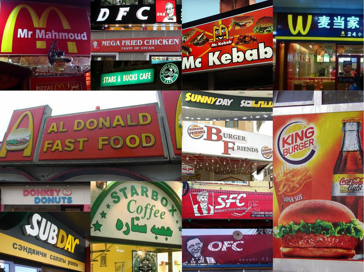
BRAND RIP OFF’S
There have of course always been rip off’s of some of the most famous fast food brands, with seemingly no-one being immune. From McDonalds to KFC and Starbucks to Burger King, who hasn’t seen one of these on their travels.
Your Brand Update
Although none of us can realistically hope to be the new Coca Cola it is clear how a strong brand perception can lead to an increase in sales, even if you don’t necessarily have the best product on the market. So how does your brand stand up to scrutiny? Has it been a ‘design it, place it and leave it’ brand logo for a few too many years? When was the last time you took a serious look at your own brand and assessed it against your competition. Even without a brand update, could the remainder of your corporate identity do with an overhaul?
At Surefoot Communications we create, enhance and support branding for multi-nationals, SME’s and small startup companies across the Thames Valley and beyond. If your brand lacks consistency or visibility, or has been cut adrift from your marketing for one too many years then speak to us for some free unbiased advice on how to move your brand design forward.
Check out some of our brand work here or call us on 01628 604324 for a chat.